
Client Brief
In 2016, over 15.5 million groups took trips on Airbnb and that trend continues to grow. According to a 2017 Airbnb survey, “Four out of five American travelers have been on multiple group trips in the last five years.” In response, Airbnb has committed to making group travel easier and they’ve already started delivering on this.
For this project, I was to imagine that Airbnb had hired me to help determine what they should build next in their effort to better support “group travelers.” It was up to me to identify areas of opportunity and design engaging solutions that solve for these unmet needs.
High Level Goals
Collect qualitative data from group travelers .
Discover and implement new features that support group travelers.
Conduct A/B testing to determine the best design solution.
The Challenge
The biggest challenge I faced with this project was accessing my creativity. Being that Airbnb is one of the most innovative tech companies to emerge in the last 10 years, I found it difficult to imagine what improvements would look like.
This was also the first project in which I ran A/B testing on my design solutions. At the conclusion of these tests, I had to face a harsh reality that every designer must at some point in their career.
My Process

1. Discovery: The Problem
Declaring Assumptions
I used Jeff Gothelf’s Lean UX as a playbook to help guide my design process for this project. Many of the design activities you will find throughout this case study come directly from his book. The first activity I chose was an affinity map for declaring my assumptions. What I like about this activity is its ability to reduce risk. By getting the guesses out of my head and on the map, I was able to identify which were in need of validation and how they should be prioritized.
I completed this activity, as well as many others on MIRO so that I could share the work with my product manager (instructor) as well as any other collaborators, (cohort) so that they could offer feedback along the way.
Example: User Assumptions Chart

Hypothesis Statements
With my assumptions laid out on the table, I began transferring them into hypothesis statements so that they could be tested during my user interviews to come. The table below represents each hypothesis to be tested. The two highlighted signify the MVP’s to be tested in the next phase.
Example: Hypothesis Table

1. Discovery: User Research
The goal of the discovery phase was to test my user assumptions and hypothesis statements from above. This meant getting feedback from real users to learn about their motivations, goals, behaviors, and pain points.
There were two types of research methods that I used in order to gather both quantitative and qualitative data, they included:
Survey Data - I published a survey on all my social media accounts in order to gather some quick quantitative data about group travel habits. In total, 24 people completed the 10 question survey.
User Interviews - I got a chance to interview three individuals who had gone on a group trip in the last 6 months, and one group that was currently planning a bachelor party together.
Survey Data
Example: Bar graph of answers to question 4

User Interviews
There were three additional key findings that I took away from the user interviews. Below I have included the assumption that was tested and the result fleshed out throughout the interview/observation(s).
Valid or Invalid
Invalid- From my conversations, it seemed communication may be still best served using conventional group messengers. Nonetheless, the ability to provide feedback is still very important to most of those questioned.
Valid- As I watched the bachelor party plan their trip I noticed they constantly toggled back and forth between homes and activities often becoming confused over the specifics. This struggle to compare options led to much frustration and at one point abandonment.
Invalid- Although some are worried about cost, they ultimately want everyone to have fun. They also select someone to do most of the planning and would rather not be inconvenienced. Rely on the planner to make the best decision, place a lot of trust in them.
Assumption
1) Users would value an internal messaging tool because it would allow them to express their opinion.
2) Users could benefit from a feature that helped them compare lodging when planning a trip.
3) Everyone would like an equal say in the process.
Insights
In this first test, I was able to validate much of my user assumptions however there seem to be different user types than I originally anticipated. As for the hypothesis statements, it seems there may be value in a few of the solutions, where others may not be as utilized such as the internal messaging feature.
2. Synthesize & Define
Meet Sam
I used the findings from my user research to construct a provisional persona, Sam. This persona helped me better understand how I could support Sam and other group travelers as they plan their trips on the app. You will notice that he has been identified as the Trip Planner user type.
Example: User Persona

User Flow
I developed a user flow that depicts how Sam and other trip planners would navigate through the new solutions designed to help support them plan group trips. Given that users may be looking for multiple features to support them, I provided three that could assist.
I created the following flow because I wanted map out the new features from start to finish. I also wanted to make sure that my solution felt both seamless and cohesive.

Next Steps
After mapping out my solutions, it was time to begin ideation. Of all the solutions that I had in mind it seemed the compare tool would offer the most value, so it became the next MVP for me to experiment with.
3. Ideate
Competitor Analysis
Before creating any sketches, I thought it would be beneficial to see how other competitors may be approaching these challenges. Perhaps there were some that already utilized this kind of technology. Using SimilarWeb and CrunchBase I looked for some of Airbnb’s direct competitors. Afterwards, I signed up for their services so that I could get a sense for type of features they had to offer.
Example Comparison Screen Flows

Insights - although I did not discover any significant inspiration from the companies direct competitors, the exercise helped me understand how they are differentiate themselves.
Dribble turned out to be a better place to get the creative juices flowing. The following screenshots gave me a lot to think about when it came to designing the compare tool feature.

Sketches
Below are a few rough sketches of the imagined compared tool. This was a quick activity for turning inspiration into ideas. It was also nice to start this way because I didn’t feel over committed to any of the ideas. Furthermore, it gave me the chance to rule out one of the ideas before spending any extra time on wireframes.
Sample Sketches

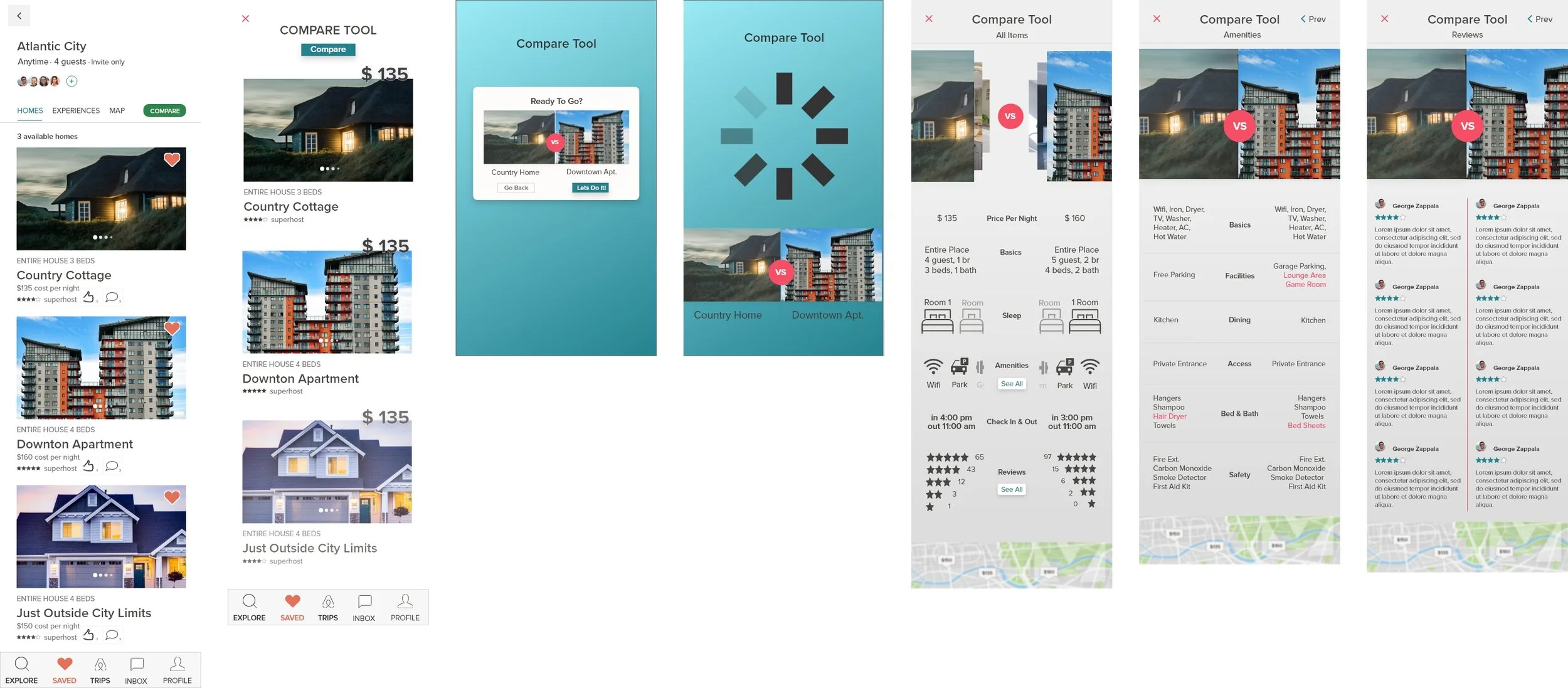
Wireframes
I moved to mid-fidelity wireframes for two of the three iterations I had though up. Below you will see a small sample of the screens the user would interact with as they decide on a rental.
A. Horizontal Scroll Compare

Side-by-side Compare

Next Steps
With both iterations of the prototype it was time to test with real users. This was my first time experimenting with A/B testing. I chose this format because although I preferred the Horizontal Scroll model, I wanted my decisions to be backed by qualitative data.
4. Validate
Usability Test
In total there were 6 tests conducted with my mid fidelity prototype. The overarching goal of each test was to gauge ease and use, and user satisfaction. To measure EOU, I timed the participants and recorded the amount of errors they made in route to their end goal. For user satisfaction, I relied on summative feedback after they had finished going through each prototype.
Each usability test was recorded using zoom recording software, and all findings were documented within an excel spreadsheet, so that the team could go through and synthesize the information.
Example Screen Recording

Insights
To my surprise the participants actually preferred the side-by-side comparison tool. Many thought the more conventional design was easier to use and understand. Vertical scrolling in this case was the winner. They also provided a lot of additional feedback that led to better high fidelity iterations. Feel free to skim through the changes made in the next phase.
5. Iterate
Changes
Example: Changes to the All Items and Reviews screen

High Fidelity
Below is a small sample of the high fidelity screens depicting the compare tool, as well as others such as the feedback and internal mapping feature. Feel free to skim through them.
A. Compare Tool
B. Feedback & Map Feature

Next Steps
UI Upgrade
Being that this was my first comprehensive design project and case study, there was a lot learned and a lot more to be done. The next steps for this project would be to clean up the UI work. Being that this is a cutting edge feature, the visuals need to reflect that.
Also this project could benefit from seeing it in Desktop or iPad iterations. Considering a lot of people including myself plan their trips on desktop over mobile (user research confirmed this for me at least) making a desktop version would be crucial.
What I Learned
The most challenging part of this project was the learning curve with design software. Coming from education, I had never used tools like sketch or XD before. My skills have improved immensely since than, making the actually designing a lot more fun and enjoyable.
This project also provided me with my first criticisms. I experienced for the first time reactions that defied expectation, which provided me with valuable perspective.

Next: Family Hub Redesign